How to Choose Colors That Work Together Every Time
"Hearst Magazines and Yahoo may earn commission or revenue on some items through these links."
Color theory is a crucial part of interior design. Knowing how to use the color wheel to create an inspiring, original palette for your home can help make decorating decisions much easier. While it can feel natural to play it safe with certain color combinations, such as blue and white, using complementary colors is an alternative method for those who prefer a bolder design style.
Complementary colors are the pairings of colors across from each other on the color wheel, and when used correctly, they can revamp a room's entire personality. While some complementary color design schemes may seem too loud (or, as in the case of red and green, remind us too much of Christmas), there are many clever ways to pull them off. You just have to know how to work with them.
“It's reminiscent of an elementary school,” says Amanda Wyatt, an interior designer and founder of Design Insider. “But with the right shades and tone, these hues can shift into something elevated.”
If you're looking to bring more complementary colors into your home without it looking chaotic, we have you covered. Read on to learn what you need to know about using complementary colors in your design scheme at home.
What Are Complementary Colors?
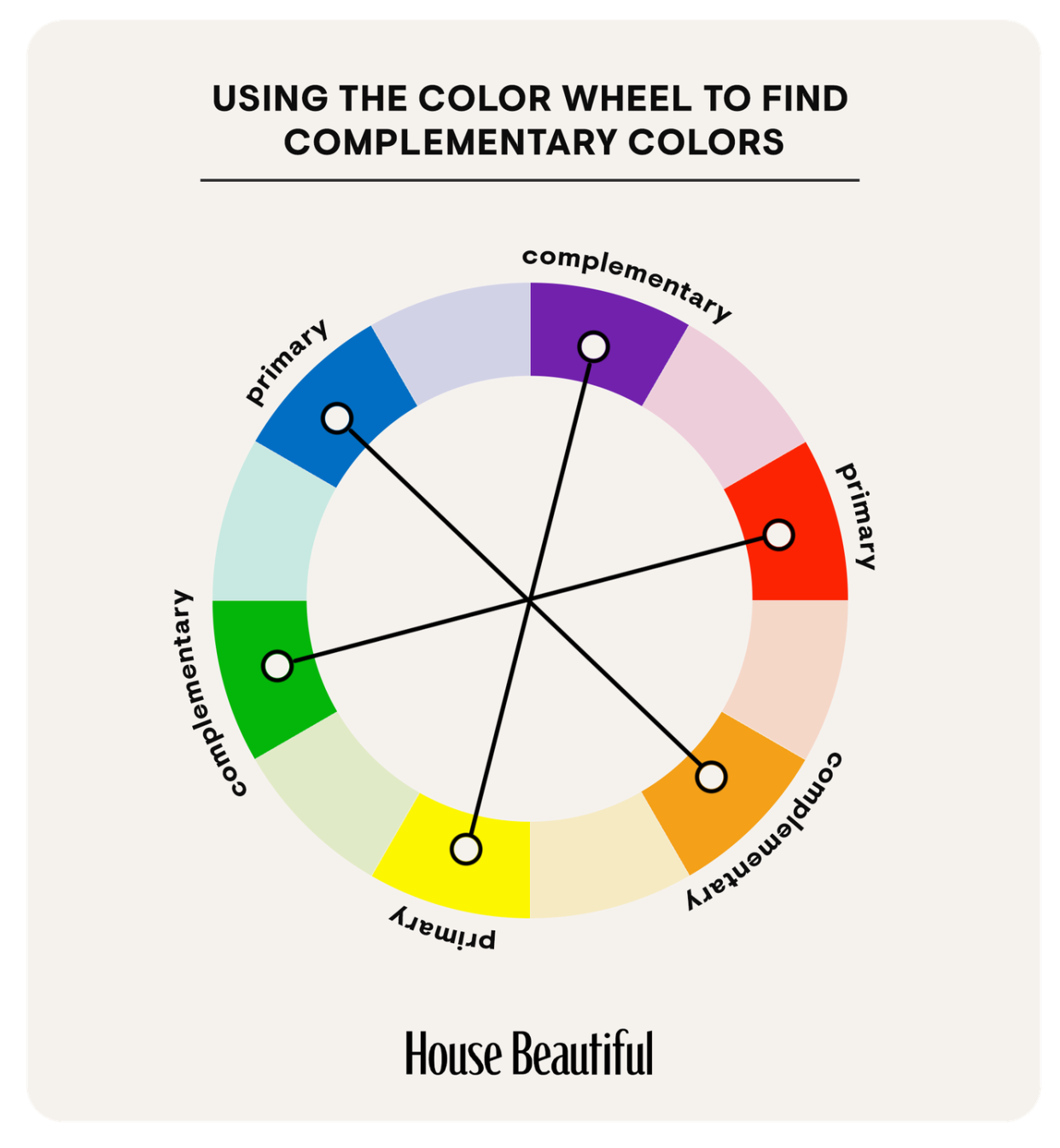
Complementary colors are the pairs of colors directly across from one another on the color wheel. These are considered opposites and consist of one primary and one secondary hue. When used together, complementary colors help each other to appear brighter. The three pairings are yellow and purple, red and green, and blue and orange.
How Do Complementary Colors Work?
Each color lights up different receptors (scientifically called cones) in our eyes. According to Pantone, human eyes can process over 100 color shades in a million combinations. Complementary colors work in tandem to light up multiple receptors at once, thereby making each one brighter and bolder than it would be on its own. The high contrast between the two is stimulating, making them a visually interesting pairing.
What Is Blue's Complementary Color?
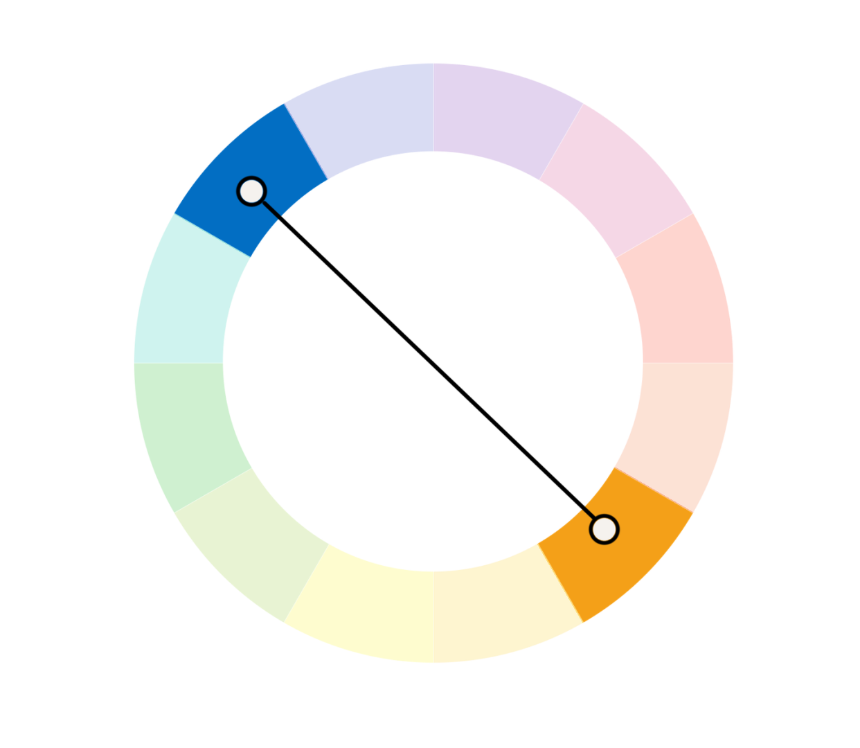
Blue's complementary color is orange. While this combination can veer into sports-logo territory if not used carefully, the two colors can also contrast beautifully for a vibrant statement.
“I like to start with navy as my blue,” says Wyatt. “Pair it with a coral orange for a different take on this combination.”
What Is Red's Complementary Color?
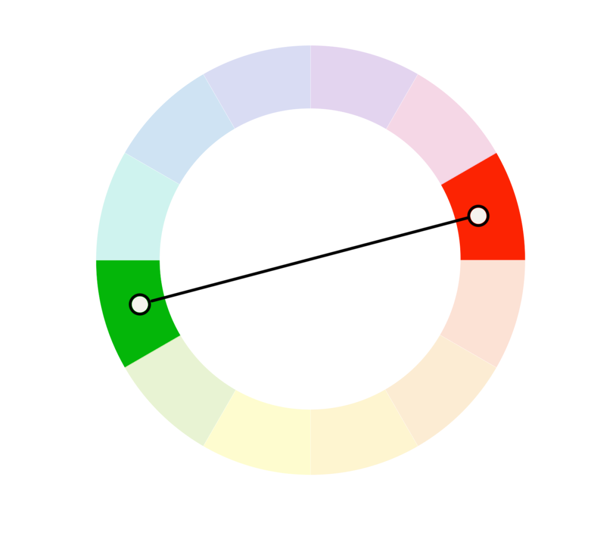
Red's complement is green. Despite the obvious Christmas connotations, red and green can work harmoniously year-round. This is because the nature-centric tones in green help to offset red's fiery appearance.
What Is Yellow's Complementary Color?
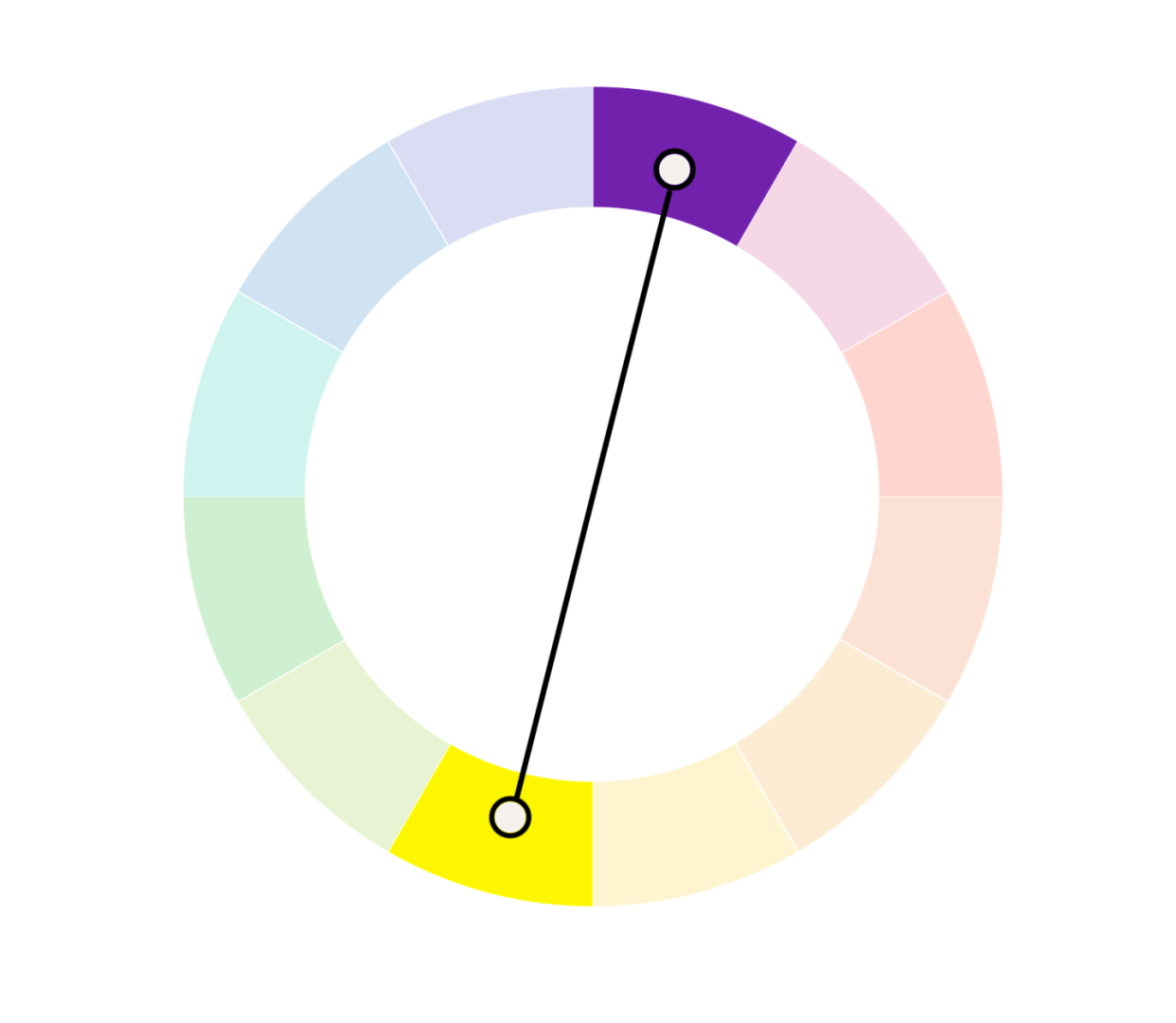
Yellow's complementary color is purple. If you have a cheerful patch of pansies growing in your garden, you'll know what a gorgeous combination these opposite colors can create. We especially love them in pastel tones.
How to Use Complementary Colors in Your Home
Blue & Orange
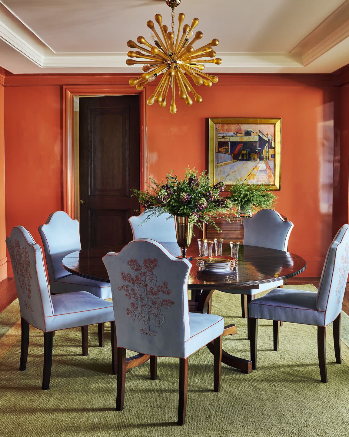
Take inspiration from designer Katie Ridder and opt for a paler version of these traditionally jewel-toned complements. The high-gloss orange walls of this dining room help create a welcoming and warm environment (essential for a good dinner party) while the pastel blue chairs incorporate texture with velvet upholstery. The blue also helps to calm the fiery orange.
Red & Green
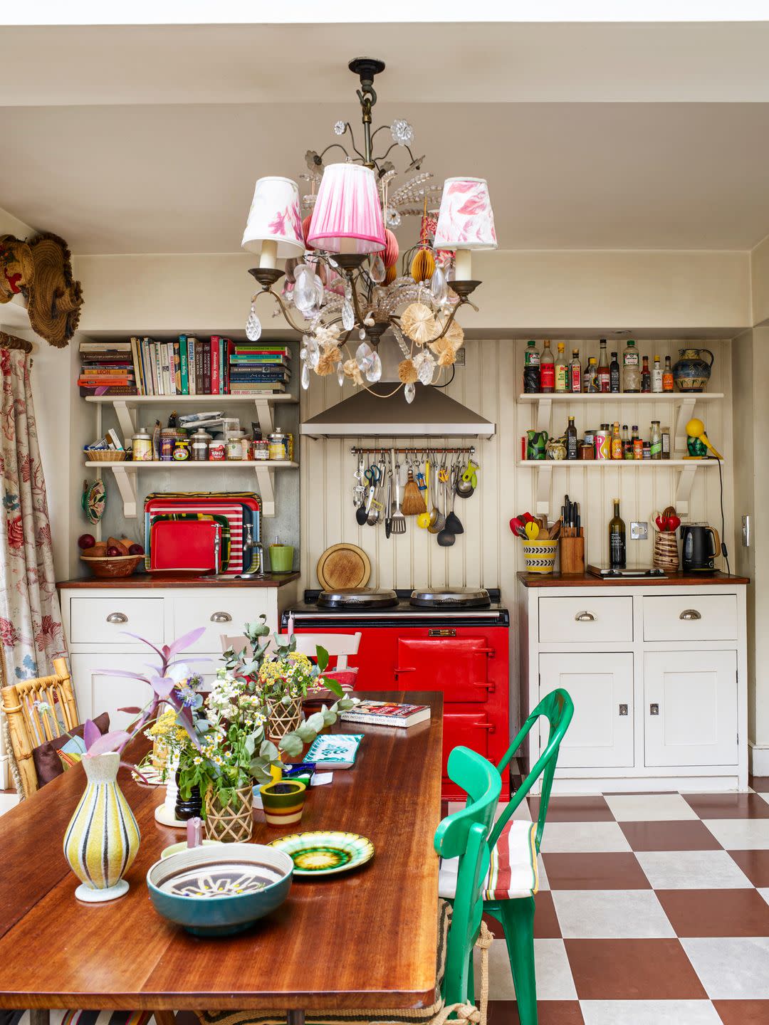
In Lucinda Chambers's London home, red and green are used as accent hues in the mostly neutral kitchen. These pops of color play off of each other for a playful feel. Green is also seen in the houseplants on the dining table—this is a great way to incorporate green into a red space for a more naturalistic feel.
Yellow & Purple
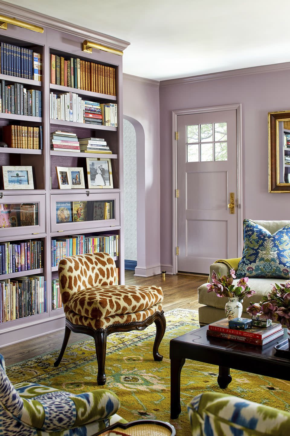
The key to utilizing yellow and purple without looking like an LA Lakers superfan is to lean into pastels. Yellow is the clear accent here, used in a mustard-like tone only in the soft furnishings and decor. Lavender is used on all the walls and helps to bounce natural light around this living room designed by Melissa Colgan.
Follow House Beautiful on Instagram and TikTok.
You Might Also Like
