The 14 Best White Paint Colors That Interior Designers Swear By
"Hearst Magazines and Yahoo may earn commission or revenue on some items through these links."
Finding the best white paint color for your space can be a surprisingly tricky task. White goes with every possible interior design style, but it's important to get the tone just right, otherwise the space will look cold or dull. To choose the best white paint color, you'll need to consider factors such as undertones, brightness, and the specific room you’re updating to make the area feel bright and spacious.
“White is the hardest color for most people to pick because there are so many options,” says Nicole Gibbons, interior designer and founder of the paint brand Clare. “In a north-facing room, you’ll want a warm white to balance out the cold light. In a south-facing room, cooler whites counteract the yellowness of bright sunshine.”
Our list of the 14 best white paint colors includes insight from designers and industry experts on which ones to use in which rooms. Keep reading to learn everything you need to know about how to select a white paint color for your home.
Find more color inspiration here:
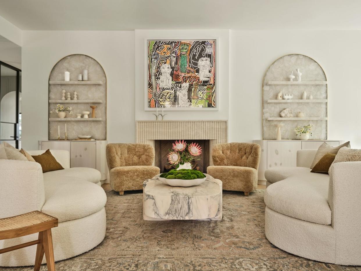
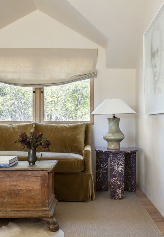
Whimborne White by Farrow & Ball
Designer Jaqui Seerman wanted to soften this ultra-modern California home to be a comfortable place for a growing family. She settled on Wimborne White from Farrow & Ball as the ideal off-white with warm undertones.
Get the Look: Wimborne White by Farrow & Ball
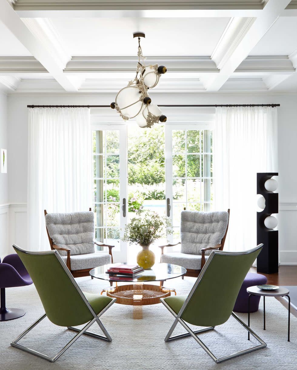
Spring in Aspen by Benjamin Moore
Throughout this New Jersey home designed by Elaine Santos, a black-and-warm-white color palette creates a sophisticated, inviting environment. It’s ideal for this family, who fell in love with “the sixth borough.” The newly restored, historic home is tranquil yet energetic for this young family.
Get the Look: Spring in Aspen by Benjamin Moore
Chantilly Lace by Benjamin Moore
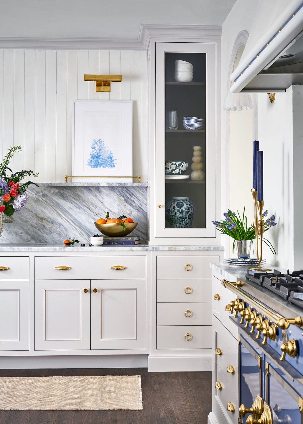
For House Beautiful and Delish editorial director Jo Saltz's family kitchen, Saltz wanted a white that felt bright and clean. "Paint is so hard to recommend because you really need to see it in the space," explains her designer, Jean Stoffer, who recommended a few blue-tinged whites to counteract the warm, glowy light from a south-facing window. After living with swatches of four colors on the wall for a spell, Saltz picked Chantilly Lace from Benjamin Moore.
Get the Look: Chantilly Lace by Benjamin Moore
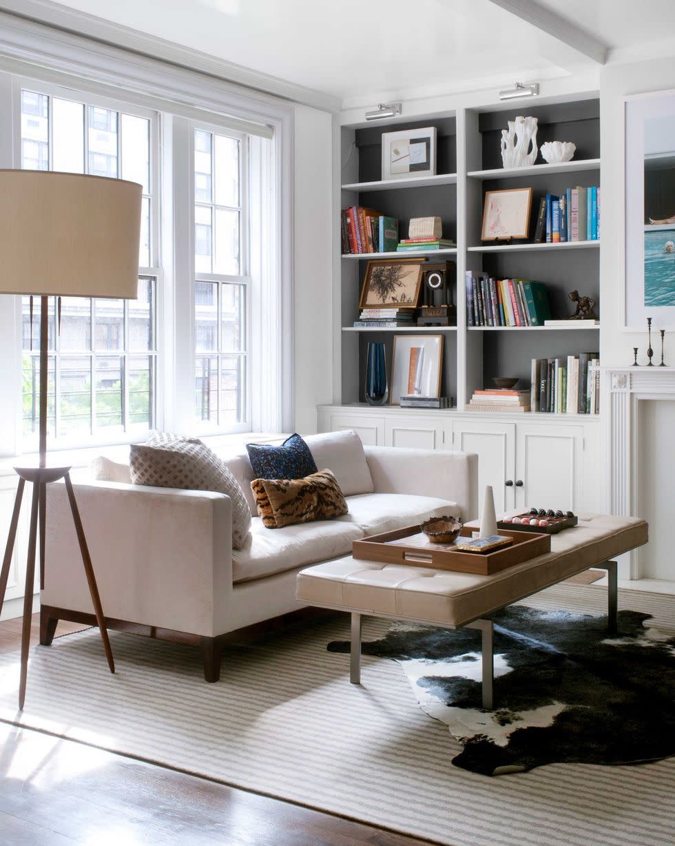
Super White by Benjamin Moore
"Benjamin Moore Super White creates a clean canvas that's perfect for walls where you plan to hang a lot of art," says Baltimore designer Laura Hodges, who uses it in many of her projects. With southern exposures, daylight will add warmth, so use a cooler white.
Get the Look: Super White by Benjamin Moore
Paper White by Benjamin Moore
While designers warn that certain cool-toned whites can be antiseptic, in the proper setting, they have a crisp elegance. Look for a touch of gray to keep things from getting too chilly, advises designer Kelly Giesen, who painted her Manhattan apartment in Benjamin Moore's Paper White. “It’s incredibly soothing,” she raves.
Get the Look: Paper White by Benjamin Moore
Frostine by Benjamin Moore
You should also keep in mind that what's outside a room can matter as much as what’s in it, says Gibbons: “White paint will always reflect the environment around it, so if you have big picture windows overlooking lots of trees, expect some of that greenery to come back into the room.” This icy white with a blue-green undertone was Susan Noble Jones’s key to reinvigorating a sun-filled New Orleans house.
Get the Look: Frostine by Benjamin Moore
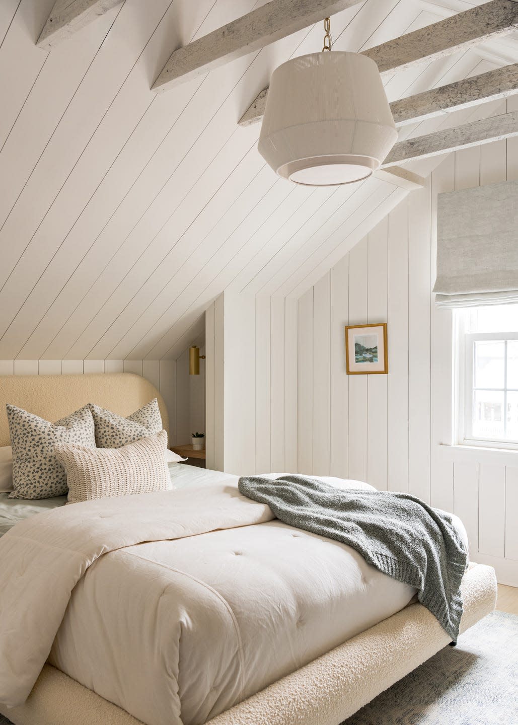
Pale Oak by Benjamin Moore
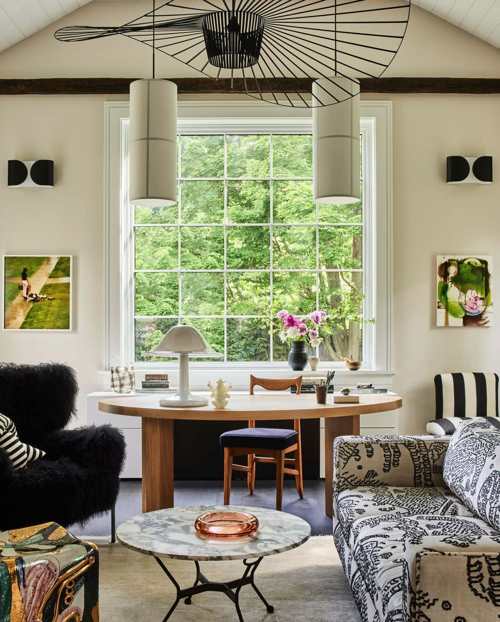
“This space was meant to be cozy,” says designer Kristin Fine of her Connecticut home office. After assessing how natural light moves through the space, she painted the walls in Benjamin Moore's Pale Oak for an inviting look. Additional light sources ensure the room is a welcoming environment from day to night.
Get the Look: Pale Oak by Benjamin Moore
Cloud Cover by Benjamin Moore
“White is super tricky,” admits designer Andrew Howard. “If you have wood paneling and lots of color and patterned fabric, white walls can look fantastic. But white-painted rooms with drywall that don’t get a ton of natural light can take on an insane asylum feel if you aren’t careful. Moral of the story: I love white, but only in rooms that get a ton of light!” His favorite hue? Benjamin Moore Cloud Cover. “It is not too white and doesn’t turn ivory or yellow like some whites tend to.”
Get the Look: Cloud Cover by Benjamin Moore
Decorator's White by Benjamin Moore
This neutral white is designer Timothy Brown’s go-to when the decor skews modern, like in this Hamptons project: “It’s crisp, but it has depth." A neutral white is also perfect for showcasing art. "There’s a reason why galleries use pure white—any undertone will make the wall color noticeable," says Gibbons.
Get the Look: Decorator's White by Benjamin Moore
Simply White by Benjamin Moore
Since whites often appear yellower with a lacquer finish, says Katie Lydon, steer clear of creamy tones if you’re going the high-gloss route. A true neutral white like this one is a safer bet. "It looks cool on the chip, but actually has a nice glow to it," says Lydon.
Get the Look: Simply White by Benjamin Moore
Pure White by Sherwin-Williams
"Searching for a true white paint color is not an easy task," says Studio Ten 25 owner and designer Abbe Fenimore. "What may look like a bright white on a swatch can end up looking too warm with yellow undertones or too icy with blue undertones." For a sharp, clean white, she uses Pure White by Sherwin-Williams. "It works equally well as an oil-based paint on cabinets and as a latex for walls," she notes.
Get the Look: Pure White by Sherwin-Williams
All White by Farrow & Ball
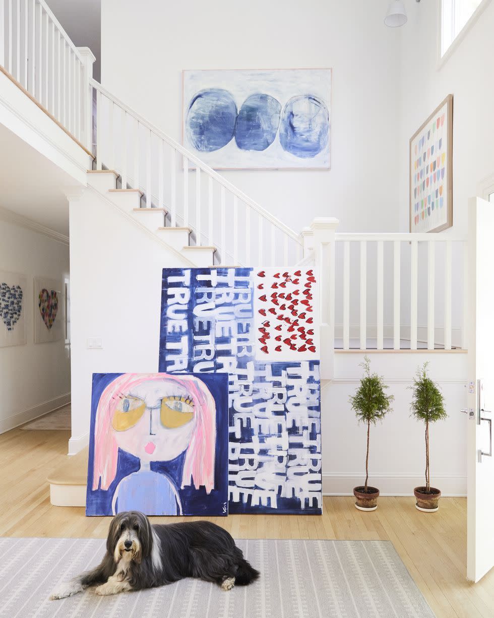
While Farrow & Ball considers All White a neutral, artist Kerri Rosenthal says it has a real warmth to it. “I don’t like too much yellow and I don’t like stark, cold white either,” Rosenthal says. “When the sun hits it, you want it to warm up. I find that with Farrow & Ball paints especially, so I tend to use those.” She used All White throughout most of her Connecticut home.
Get the Look: All White by Farrow & Ball
Swiss Coffee by Benjamin Moore
This creamy white was the ideal pick for a bright and airy Hawaiian vacation retreat designed by Catherine Kwong. "The lighting on the Big Island is really bright, so we didn’t want a pure white," she explains. After months of testing colors, she landed on Swiss Coffee. "It has little softness to it," she says.
Get the Look: Swiss Coffee by Benjamin Moore
You Might Also Like
